Learn how colour theory can improve your home decor
Suumit Arora shared how to apply colour theory to create balanced home interiors
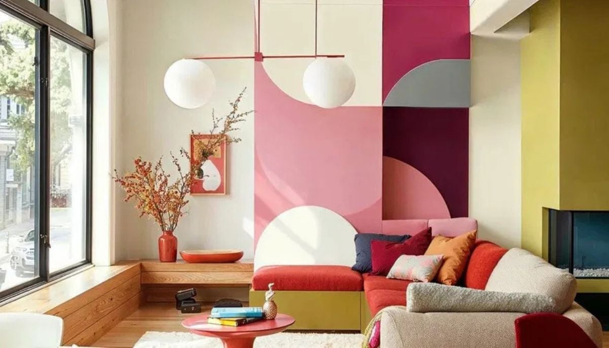
Artiure founder and CEO Suumit Arora explained how homeowners can implement the principles of colour theory to create visually balanced and mood-enhancing home interiors on Thursday, July 16, 2026. The design expert detailed how strategic choices in colour temperature, art selection, and visual hierarchy can prevent common decorating mistakes.
Hindustan Times reported on the interior design guidance, which outlined the distinct psychological and physical effects of different colour temperatures. Arora explained that warm colours with yellow or orange undertones, such as terracotta, amber, and burnt sienna, visually bring walls closer to create a sense of cosiness and intimacy. Conversely, cool colours with blue or green undertones, like slate blue, sage green, and muted teal, expand a room visually while lowering its energy to establish a calmer environment.
The specialist highlighted that the most common mistake homeowners make is introducing too many competing shades, which generates distracting visual noise instead of a cohesive story. He noted that incorporating artwork is one of the easiest ways to introduce colour effectively without committing to full renovations or repainting.
To establish a balanced room, the designer recommended creating a clear visual hierarchy consisting of one dominant tone, two supporting shades, and a single contrasting accent. He also observed that identical pigments will look entirely different depending on their physical medium, noting that archival prints on museum-grade paper capture light shifts with far more depth than mass-produced posters. Arora concluded by suggesting that specific room functions should dictate colour choices, recommending welcoming warm tones for living areas and soothing cool shades for bedrooms.
How can warm and cool colours affect a room?
- Warm tones like terracotta and amber make spaces feel smaller, closer, and far more intimate.
- Cool shades like slate blue and sage green visually expand rooms and lower overall energy.
- Selecting the correct colour temperature helps define whether a space feels cosy or spacious.
What is the mistake homeowners are making?
- Homeowners frequently clutter rooms with too many competing shades, creating distracting visual noise.
- Visual overstimulation occurs when a room lacks a singular, cohesive colour story for the eyes.
- A lack of focal points forces the observer's eyes to bounce around constantly.
Can artwork help?
- Displaying artwork provides an easily controlled method for adding colour without repainting walls.
- Large art pieces concentrate specific colours, providing edges, texture, and visual depth to rooms.
- Strategic art placement acts as a visual anchor to make hollow spaces feel balanced.
How to create a balanced colour palette?
- Build a clear visual hierarchy using one dominant tone and two supporting tones.
- Introduce a single, contrasting accent colour through small elements like a vase or cushion.
- Consider how different materials, like canvas or textured paper, alter the appearance of a shade.
What are the best colours for different rooms?
- Living room: Use warm terracotta or gold shades to make social spaces feel welcoming.
- Bedroom: Opt for soft blues or muted greens to create a calm, restful sleep environment.
- Study: Combine deep navy or forest green with a warm accent to aid focus.
- Hallway: Position a single, confident piece of artwork to elevate transition areas.
Note: This article is based on user-generated content from social media, and the claims have not been independently verified.